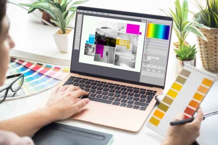
If you buy into the idea that art can make the world a better place, then graphic design is a form that you need to get involved in. After all, graphic design can be used for so much more than just creating advertisements or websites.
If you’ve never really thought about getting involved with anything like graphic design, it might be about time you learned a few tips for making better designs.
So make a few notes and keep scrolling to learn graphic design tips that you need to start following today if you want to produce better work.
1. Brainstorming Your Ideas
One of the most important things that you can do is to brainstorm your ideas before you start designing. This will allow you to come up with several different concepts that you can then choose from.
2. Keep Your Designs Simple
This will make them more effective and easier to understand. When it comes to colors, less is often more. Choose a limited color palette and stick to it. This will help to create a cohesive design.
3. Make Sure Your Designs Are Readable
Make sure that your designs are readable. Use clear fonts and make sure that the text is large enough to be easily seen. These are just a few of the graphic design tips that can help you create better designs.
4. Institute Good Design Habits
Always start with a clean slate. Whether you’re starting from scratch or working with pre-existing content, it’s important to have a clean, organized workspace.
It’s also important to take the time to plan out your design before you start working. This means sketching out your ideas, creating a color palette, and choosing your fonts ahead of time.
Once you have a plan in place, you can start to put your design together. And last but not least, don’t be afraid to experiment. Trying new things is the only way to grow as a designer.
So don’t be afraid to step outside of your comfort zone and experiment with new techniques and styles.
5. Pay Attention to Alignment
Making sure everything is aligned correctly can make a big difference in the overall look of your design. There are a few different ways to align elements in your design. Here are the two most common ways of alignment:
Use the Rule of Thirds
This rule is very simple; you just need to divide your design into thirds, both horizontally and vertically. This will give you nine equal parts. Then, you need to place your important elements along these lines, or at the intersections of these lines.
This rule is important because it helps to create balance and visual interest in your design. When done correctly, it can lead to a more pleasing and successful design.
Use a Grid
This will help you to create a more balanced and organized design. A grid can be created by simply drawing lines on your paper or using a ruler. Once you have a grid, you can start to place your elements on the page in a more deliberate way.
Keep in mind the golden ratio when placing elements on your grid. This will help you to create a more visually pleasing design.
6. Use the Hierarchy of Information
This means that you need to order your information in a way that is easy for people to understand. The most important information should be at the top, followed by the second most important, and so on.
This will help people to quickly and easily understand your designs.
7. Use Negative Space
Graphic design is all about creating a visual language that communicates a specific message to a specific audience. Negative space is the space around and between the positive elements of a design.
Here are some reasons why you need to use negative space in your designs:
- To create balance
- To create emphasis
- To create visual interest
- To create a sense of order
8. Use Typography
Good typography is key to good design. Period. That’s because typography is one of the first things we notice in a design, and it can actually make or break a design. So, how do you create good typography? Here are a few tips:
Choose the Right Font
This is perhaps the most important decision you’ll make when it comes to typography. The font you choose will set the tone for your entire design, so make sure it’s a font that you love and that fits the design.
Use Contrast
You want your typography to be easy to read, and one of the best ways to achieve that is by using contrast. Make sure your font is contrasting with your background color.
9. Be Confident with your Craft
Keep learning Whether you’re taking classes, reading books, or simply experimenting, it’s important to keep learning and expanding your skills. The more you know, the more confident you’ll be when creating designs.
Ask for feedback from others, whether it’s friends, family, or fellow designers. Hearing constructive criticism can help you identify areas to improve and give you the confidence to make changes.
Be willing to take risks. Don’t be afraid to experiment and try new things. It’s the only way to grow as a designer. If you also want to know where to hire graphic designers, there are plenty of resources online like The FreeUp Marketplace.
Follow These Graphic Design Tips Starting Today
If you’re looking to create better graphic designs, following these tips will certainly help you along the way. Keep things simple, try different approaches, use white space, find inspiration, and get feedback.
And, don’t forget to have fun with it! After all, graphic design is about creativity and self-expression.
So, what are you waiting for? Follow these Graphic design tips starting today!
Did you find this article helpful? Check out the rest of our blogs!


